
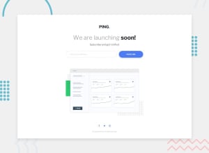
Ping Coming Soon Page using HTML, CSS, and JavaScript

Design comparison

Solution retrospective
this is definitely the most successful media query for mobile screens i have done so far T_T takes so many trials and errors to match the exact design i want it to have.
Community feedback
- @jhellardPosted about 2 years ago
Looking good NIÑA! For your
img-dashboardclass I'd suggest not setting a fixed size, allowing images to adapt to the screen size and still look great can be one of the trickiest things to do. Try something like :width: min(100% - 2rem, 800px);You can read more about the
min()function here but what it's doing in that example is setting its minimum width to 100% of the parent - 2rem (Gets averaged to 1rem each side) and the 800px is setting the maximum width it will grow to. Give it a go, it's a super handy function!0

Please log in to post a comment
Log in with GitHub
Join our Discord community
Join thousands of Frontend Mentor community members taking the challenges, sharing resources, helping each other, and chatting about all things front-end!
Join our Discord