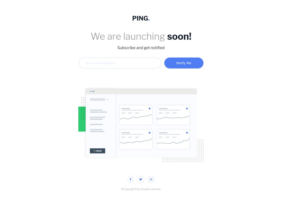
Design comparison
SolutionDesign
Community feedback
- @grace-snowPosted almost 2 years ago
Good job!
A few things I noticed:
- There's no need to change the main padding on larger screens. Remove anything in CSS that doesn't need to be there
- The logo is EXTREMELY valuable content! It's alt cannot be blank
- Why does the logo have huge font size on it?
- Usually a logo would go in a header landmark outside of main and be wrapped in a labelled link. Maybe less important on a landing page like this, but figured I'd mention it anyway. Doesn't mean you need to change it here
- Inputs must be labelled
- An email input should be an email type and have autocomplete on it
- The error message element should be wrapped in another element (like a div) that has a unique id and aria-live attribute. The input should be aria-describedby that ID. This programatically links the error with its input and tells the browser to sort of 'watch for changes' on that element and announce them to screenreaders if the elements inside change
- I recommend always including the type attribute on buttons. It's a good way to avoid bugs
- The aria labels on the social links should not say "link" in them. They are already on link elements!
- The social icons are squished/distorted. Icons are one of the few times when you should use an explicit width and height (in rem) or at least an aspect ratio
- DO NOT DO THIS:
font-size: 62.5%;. If you want to understand more why it's a pretty terrible thing to do, keep an eye on my blog that launches tomorrow: FEDmentor.dev. I've written a post about that one day this week. - DO NOT DO THIS EITHER:
outline: none;on interactive elements. In one line you've made the form inaccessible to keyboard users, who rely on visible outlines - JavaScript should not be changing inline styles. That's an anti-pattern generally. Let CSS handle all styling. Let JS do things like toggle classes and attributes. That's actually also causing breakage for users who see the error and then rotate device or resize the window. Unnecessary to be adding margin to the button.
- Don't style on IDs. That's another post I've got coming out this week (and another about why using IDs as javascript selectors ain't great either)
0
Please log in to post a comment
Log in with GitHubJoin our Discord community
Join thousands of Frontend Mentor community members taking the challenges, sharing resources, helping each other, and chatting about all things front-end!
Join our Discord
