

Design comparison

Solution retrospective
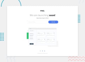
Struggle for a while to make the input form looks better. 🥳 However, still have a little problem with the desktop size. Want to make the email input smaller, but it has empty left space. Not sure where this space come from. 🥲
Community feedback
- @elaineleungPosted over 2 years ago
Hey Pon, I had a look at your code in the inspector; see whether this helps:
- First, try setting the width of your
header format a fixed width, e.g., 650px. Change the width of the submit button also to a fixed width, e.g., 170px, and change the width of your.email__containerto 100%. That should eliminate the empty left space. - Next, to create a gap between the button and the input, either (1) add a
gap: 20pxproperty (should work for almost all browsers now) forheader form, or (2) change the input's width from 100% to 95%
The reason for the empty left space: I see that your form is using flexbox, and I can also see that the width of your submit button is 20%, so naturally the other 80% should be the
.email__container. The problem is, its width is set at 70% instead (I'm guessing you wanted to create a gap between the input and the button), and that explains the empty space around the container, which of course includes the nested input. In other words, that empty space to the left and right of the input is the leftover 10%. It wouldn't matter here if you usealign-items: startto move the input to the left; there's no room for the input to shift because its width is 100%, meaning it takes up all the available space of the email container's 70%, and the furthest left it can go is still within the 70%.Hope this helps!
Marked as helpful1@ponhuangPosted over 2 years ago@elaineleung
Hello Elaine, how are you?
I thought it will be easier and flexible to use % than fixed unit in the beginning. However, couldn't figure out the space issue. But now I understand where the space from.
Thank you a lot for helping me out. 🥰 Have a great day
0@elaineleungPosted over 2 years ago@ponhuang You're welcome, Pon! You can still use percentage and just test things out, especially now if you understand what went wrong; it all depends on the screen size, and also the media query you're using (if you're using one). For example, if you had
header format 70% and find it too wide, then try something smaller like 60%. I usually use percentage with my own projects, but with Frontend Mentor challenges I find that it's better to use pixels if I want my final design to match up to the original one.1 - First, try setting the width of your

Please log in to post a comment
Log in with GitHubJoin our Discord community
Join thousands of Frontend Mentor community members taking the challenges, sharing resources, helping each other, and chatting about all things front-end!
Join our Discord