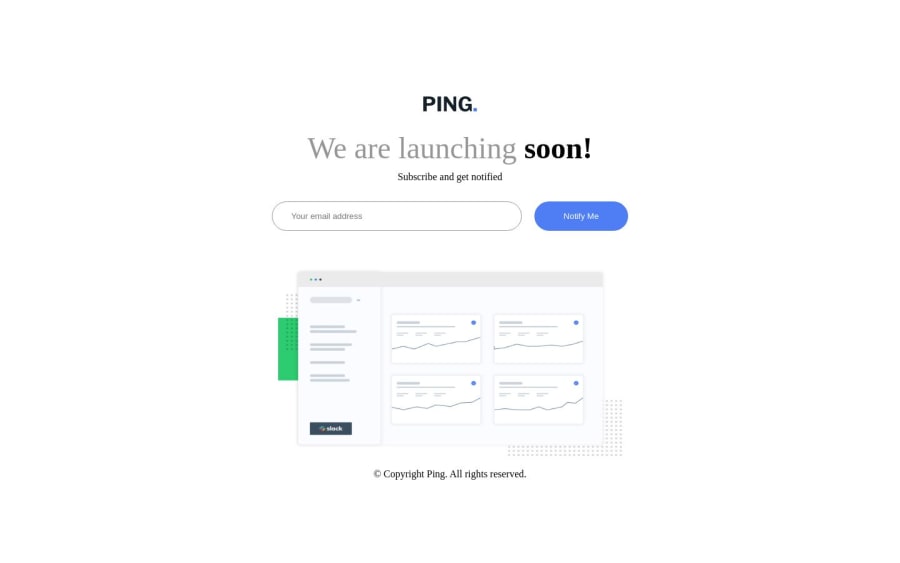
Design comparison
SolutionDesign
Community feedback
- @VCaramesPosted about 1 year ago
Hey there! 👋 Here are some suggestions to help improve your code:
- Every site should ALWAY have ✅ a
mainelement not only for semantic purposes but also to help assistive technology find the main content of your content. For this challenge, it will serves as the component’s container ⚠️.
More Info: 📚
- The logo’s
alt tagdescription needs to be improved upon ⚠️; it should state the company’s name.
- Your
email inputandbuttonneeds to be wrapped inside aformand have a visibly hiddenlabelattached to it for improved accessibility.
- The social media icons are missing⚠️ from your site.
- Your email validation needs work as
email@[email protected]is considered a valid email, when it should not.
- When the user enters a valid email⚠️, It should have some sort of confirmation stating that the email is valid to improve user experience ✅.
If you have any questions or need further clarification, feel free to reach out to me.
Happy Coding! 👾
0 - Every site should ALWAY have ✅ a
Please log in to post a comment
Log in with GitHubJoin our Discord community
Join thousands of Frontend Mentor community members taking the challenges, sharing resources, helping each other, and chatting about all things front-end!
Join our Discord
