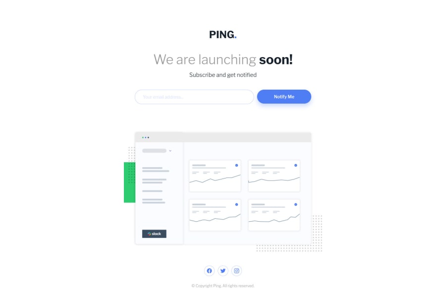
Design comparison
SolutionDesign
Solution retrospective
Wondering what the ideal way to keep the dashboard illustration in place is; I had a margin-top that counteracted the downward shift, based on the added space from the error message.
Besides that though, I'd appreciate any feedback!
Please log in to post a comment
Log in with GitHubCommunity feedback
No feedback yet. Be the first to give feedback on Brendan Hyde's solution.
Join our Discord community
Join thousands of Frontend Mentor community members taking the challenges, sharing resources, helping each other, and chatting about all things front-end!
Join our Discord
