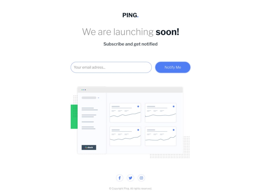
Design comparison
Solution retrospective
I am just a beginner and would appreciate any feedback.
Do I have good practices? What errors do I have? How could I improve my code?
Thanks <3
Community feedback
- @ApplePieGiraffePosted almost 4 years ago
Hello, MasterKrab! 👋
Nice to see you complete another challenge! 😀 Good work on this one! 🙌 I like the smooth transition of the outline around the email input element! 👍
I only suggest perhaps increasing the size of the heading and subheading just a bit in the mobile layout (even they might be smaller than that of the desktop layout, they look a little too small, at the moment). 😉
Keep coding (and happy coding, too)! 😁
2 - @darkshadowultimatePosted almost 4 years ago
First I wanna say that you did a really good job 👍🏻.
Second, I’d like to make some suggestions:
- Now there’s the cursor pointer on the social media icons only, extend it to the whole circle which contains the single icon ;
- The “Notify Me” button changes its color for the hover effect but it’s without transition. Add a simple transition effect and it will improve for sure. Also considering that we’re talking about a button, make the cursor “pointer” ;
- The cursor of the mouse inside the input email for inserting the e-mail I think it would be better if it was where there’s the “Y” of “Your” (while right now is way more back) ;
- Last but not least, I think the font-size you’ve used for the button and the input email is a little bit bigger. Also make the button text bold.
Let me now what you think 😁 and wish you the best.
1@MasterKrabPosted almost 4 years ago@darkshadowultimate I agree with your comments, thank you very much.
0 - @RocTanweerPosted almost 4 years ago
Hello there,
I would like to suggest that your email varification regex is not working...
[email protected] is not a valid email.
And icons should have hover effect
Hope it helps 🙂
1@MasterKrabPosted almost 4 years agoHi @RocTanweer, I will check the regex.
The icons only have the hover effect on desktop, because on mobile it does not make sense to add it.
Thanks for the feedback!
0
Please log in to post a comment
Log in with GitHubJoin our Discord community
Join thousands of Frontend Mentor community members taking the challenges, sharing resources, helping each other, and chatting about all things front-end!
Join our Discord