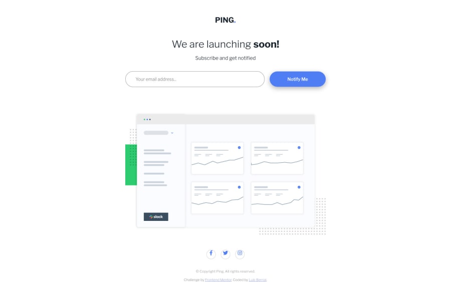
Design comparison
Solution retrospective
Hello Community,
Hope you are having a great day. My question for you all is:
- What is your strategy to add a perfect circle border around an icon?
Thank you all, and hope you have a nice day. :)
Community feedback
- @tedikoPosted over 3 years ago
Hello, Luis! 👋
Congrats on finishing another challenge! Your solution responds well. In addition to Matt feedback here's my few suggestions:
- Read about semantic. Semantic elements lead to more consistent code, they are easier to read and improve accessibility.
- Since your
.logo
image is decorative youralt
text should be provided empty (alt="") so that they can be ignored by assistive technologies, such as screen readers.
Good luck with that, have fun coding! 💪
1@luibernipPosted over 3 years agoThank you for that great advise @tediko. I will surely study about semantic and will remove the
alt
text in the logo. Do you have any advise on how to remove theAnchor element found with a valid href attribute, but no link content has been supplied.
accessibility issue?Once again, thank your for the information and advise.
0@tedikoPosted over 3 years ago@luibernip I believe that you have to add
aria-label
for your anchor since you have no content within anchor element to let know Screen Readers what's inside that element.<a href="#" aria-label="Follow us on Facebook"><i class="fab fa-facebook-f social"></i></a>
. Second approach is to add a screen reader only span inbetween your elements.<a href="#"><span class="sr-only">Follow us on Facebook</span><i class="fab fa-facebook-f social"></i></a>
. Style this span element to visually hide it.2@luibernipPosted over 3 years ago@tediko You are top! Thank you for that advise and for helping me in my coding rode. I followed your guidance and modified all code recommended and now the challenge has no accessibility or HTML issues. Thank you very much! :)
1 - @mattstuddertPosted over 3 years ago
Nice work on this challenge, Luis! For the circle around the icon I'd take a similar approach to you, but instead of using
display: table-cell;
I'd do something like this:display: flex; align-items: center; justify-content: center;
You could also use
place-items: center;
to replacealign-items
andjustify-content
and make it slightly shorter if you like.I'd recommend taking a look at the accessibility report and try resolving those errors. Keep up the great work! 👍
1@luibernipPosted over 3 years agoHello @mattstuddert, thank you for your comments! I have changed current code to
place-items:center;
so it's cleaner.Accesibility issues have been addressed except the ones regarding
Anchor element found with a valid href attribute, but no link content has been supplied.
Somehow I haven't been able to make it understand that <i> is the link content.Thank you once again for your help and comments, if any other recommendation runs through your head I will be very glad to receive it.
Have a great day! :)
0
Please log in to post a comment
Log in with GitHubJoin our Discord community
Join thousands of Frontend Mentor community members taking the challenges, sharing resources, helping each other, and chatting about all things front-end!
Join our Discord