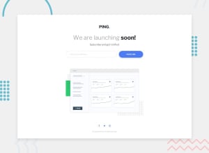
Ping Coming Soon Page - Flexbox, Fluid Typography, CSS Only Validation
Design comparison
Solution retrospective
Played around with min() for the typography, logo, and some margins. Seems pretty useful, and I'd love to explore max() and clamp() in the future. My personal challenge for this one was to try and not use any media queries. However, I couldn't find a way around them for the form. If any of you know of a better way, or have any other feedback, please let me know!
Community feedback
- @ApplePieGiraffePosted about 4 years ago
Hey, Anna! 👋
Wonderful job, once again! 👍
Everything looks great! And I like the fluid typography and the hover states of the SVG icons! 😉
The only way I can think of making the form responsive without media queries would perhaps be to use CSS grid for the container or wrapper and the
auto-fitorauto-fillproperties to break into two rows when there isn't enough space for both the input and the button to remain in the same column—but I have yet to really play around with that functionality myself! 😆I small suggestion would be,
- Setting the
cursorproperty topointerfor the button.
Your code looks good! I noticed you're separating element and modifier classes from BEM quite nicely! 😊
As always, keep coding (and happy coding, too, of course)! 😁
2@brasspetalsPosted about 4 years ago@ApplePieGiraffe I really need to start using Grid more - I know I rely too heavily on Flexbox. I guess it's time to try out that testimonials challenge! I also wondered something similar with auto-fit/fill, which I agree is probably the best bet - but then there's the padding/size change between the inputs to consider too. Ah, well - what's a few lines of media query I suppose. 🤷♀️
Nice catch! I had added the cursor change to the social icons, but apparently missed the button. 🤦♀️
😂 My sad, sad excuse for BEM. Glad to hear I'm slowly improving!
Thanks for always taking the time out to thoughtfully comment on my solutions, even more so as you're often the only one. I really appreciate it!
1@ApplePieGiraffePosted about 4 years ago@brasspetals
I'm glad to hear the feedback is helpful! 😊
I just found this sweet article from—guess where—CSS tricks!—on how to make a responsive card component without media queries. It actually uses flexbox and the
flex-wrapandflex-basisproperties (along with theclampCSS function) to make a pretty cool responsive card.You could check it out and perhaps it could help out or give you some ideas somehow! 😁
1@brasspetalsPosted about 4 years ago@ApplePieGiraffe
CSS Tricks is truly the font of all knowledge. 🙏
That article is great - thank you so much for the share! Because of it, I was able to go back in and not only improve the responsiveness of the form but do it in much cleaner way. Thanks again - you're the best! 👍
1@ApplePieGiraffePosted about 4 years ago@brasspetals
Haha, no problem!
Keep on coding! 😀
1 - Setting the
- @FloPereira75Posted about 4 years ago
Well done, exactly as on the model! I'll try to follow in your footsteps!
1
Please log in to post a comment
Log in with GitHubJoin our Discord community
Join thousands of Frontend Mentor community members taking the challenges, sharing resources, helping each other, and chatting about all things front-end!
Join our Discord
