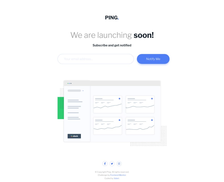
Ping coming soon page
Design comparison
Community feedback
- @grace-snowPosted over 2 years ago
Hi
Not sure why but previewing on iPhone I can’t see the social icons, it’s like they are white/transparent
This looks really good though. Only a couple of small suggestions
- when writing alt / aria-labels on links, you only need to say the link destination. So the logo link becomes “Ping - Home” and socials should just be the name of the site “Facebook” (no need to say icon)
- make sure you include button type. It’s good practice to get into the habit of including it as missing it is a common source of bugs
- you shouldn’t need to use aria-live and role alert. Using both will cause some screenreaders to read things out twice
- the aria-live wrapper should always be present on the page, not conditionally rendered. Only the contents inside should be conditionally rendered
- the input should be aria-describedby the ID of that error wrapper (the one with aria-live on it) so the two are programmatically associated
I hope these tips are helpful. Good luck
Marked as helpful1@grace-snowPosted over 2 years agoJust spotted one more thing and this is really important. You are heavily nesting scss and that will lead to specificity nightmares in bigger projects. You really don’t want to nest like that. Only nest media queries, pseudo states (like :hover) and pseudo elements (like :before). This will keep your css nice and low specificity, just as it would be if you wrote it out from scratch.
Marked as helpful1@Valeri85Posted over 2 years ago@grace-snow Wow. Thank you so much, I will dive deeper in all mentioned above.
0@Valeri85Posted over 2 years ago@grace-snow I Understand. These 2 comments absolute gold mine for me. Saved a lot of time before I reached this info by myself. Thanks one more time.
1@Valeri85Posted over 2 years ago@grace-snow I worked on your suggestions, they were very informative and helped me a lot to understand things and I will be very thankful if you can check how I did them. also I have couple of questions:
-
I want to say about buttons "type" attribute, that as I know buttons in forms are type submit by default. but I understand your point and I will practice on that.
-
Which is better to leave "aria-live" or "role" attribute?
-
Also I am interested is it ok that I have empty html tag rendered? I mean <p> tag for error message from beginning is without any text or should I hide it from css with "display: none" and toggle "aria-hidden" attribute from true to false and vice versa
-
And also I wrapped social links in "ul" "li" instead of "div", I think they are more list of social links and semantically correct if they will be wrapped in "ul"
0@grace-snowPosted over 2 years ago@Valeri85 I’d always go for aria-live over role alert. It just seems to have slightly better consistency of behaviour, but that may have changed over time it may not make much difference any more
The aria-live element definitely should not have aria-hidden on it. That could interfere with it being noted as a live region. It’s of the only times (if not THE only time) I’d say it’s good to have an empty element. I don’t think you need the em tag though. Surely the aria live is enough emphasis already (?). I’d use a div and p or a p and span there
Marked as helpful1@Valeri85Posted over 2 years ago@grace-snow Because of I really don't like "div"s I will go with "p" and "span" :D
0@grace-snowPosted over 2 years ago@Valeri85 nothing wrong with divs, don’t be scared to use them
Marked as helpful1
Please log in to post a comment
Log in with GitHubJoin our Discord community
Join thousands of Frontend Mentor community members taking the challenges, sharing resources, helping each other, and chatting about all things front-end!
Join our Discord
