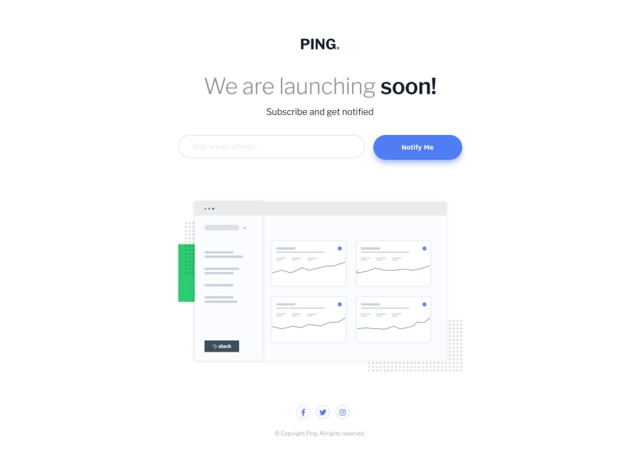
Design comparison
SolutionDesign
Solution retrospective
Any feedback would be helpful. Thanks!
Community feedback
- @ApplePieGiraffePosted over 2 years ago
Hi, Antoine Estievenart! 👋
Well done on this challenge! 👍 Your solution looks good and is responsive! 🙌
Here are a few things I'd like to suggest,
- Adding some more descriptive text for the
altattribute of the main illustration in this challenge. This text will be read by screen readers, so it's important to make sure that it makes sense to users who will be navigating your page with those tools. - Turning the social media links near the bottom of the page into actual links by wrapping each of them in a link tag. You may also want to add some screen reader-only text inside those links or add an `aria-label` attribute to them instead to make sure they can be identified by screen readers.
- Adding
cursor: pointerto the submit button of the form would be a nice touch!
Hope you find this helpful. 😊
Keep coding (and happy coding, too)! 😁
Marked as helpful1 - Adding some more descriptive text for the
Please log in to post a comment
Log in with GitHubJoin our Discord community
Join thousands of Frontend Mentor community members taking the challenges, sharing resources, helping each other, and chatting about all things front-end!
Join our Discord
