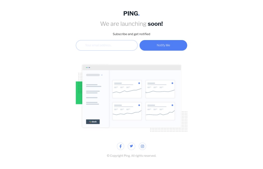

Design comparison

Solution retrospective
Any feedback is appreciated!!
Community feedback
- @ProgressOnyemaPosted almost 2 years ago
Good design:
-
“We are launching soon” text could be bumped up to help with some visual hierarchy.
-
The space between “We are launching soon” and “subscribe and get notified” could be reduced to encourage some proximity.
-
The text “Notify me” could be a bolder to give some good contrast, and the border on the input field should be the same color as the “We are launching” text to give some unity to the design.
-
The social icons could be smaller as to not compete for attention with elements that matter more.
Good design 👊🏼
1@tyVespAPosted almost 2 years ago@ProgressOnyema yuup saw those problems when comparing to the design, thanks for the feedback!
0 -

Please log in to post a comment
Log in with GitHubJoin our Discord community
Join thousands of Frontend Mentor community members taking the challenges, sharing resources, helping each other, and chatting about all things front-end!
Join our Discord