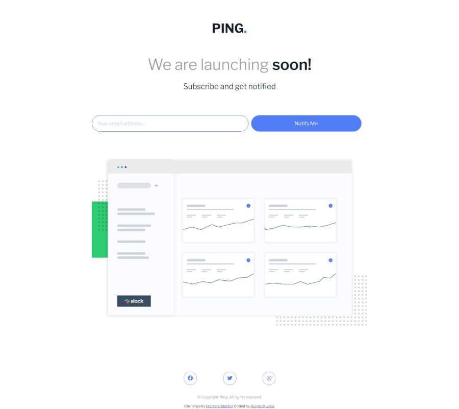
Design comparison
SolutionDesign
Solution retrospective
What are you most proud of, and what would you do differently next time?
I'm happy I was able to remember most of the javascript for this without having to look too much of it up.
What challenges did you encounter, and how did you overcome them?I had a little trouble with the social icons in the footer. It took a lot of incremental changing of the sizes until I got it.
What specific areas of your project would you like help with?Any constructive criticism is welcome!
Community feedback
Please log in to post a comment
Log in with GitHubJoin our Discord community
Join thousands of Frontend Mentor community members taking the challenges, sharing resources, helping each other, and chatting about all things front-end!
Join our Discord
