Design comparison
Solution retrospective
Any feedback is appreciated
Community feedback
- @kushal-shekhar81Posted about 4 years ago
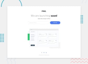
A really nice design! There is just one slight thing that you could have worked on: The bottom margin. In your website, the last line (Created by.....) is almost at the edge, where you could add margin-bottom style so that the display would look better :)
Good luck! :)
1 - @DhadhaziPosted about 4 years ago
Hello Andres Felipe,
Matching the design nicely, good job!
I suggest to put an outline:none to the input field, so we don't get the blue square around it when active. Just for next time:)
Kepp up the good work!
1 - @ApplePieGiraffePosted about 4 years ago
Hey, Andres Felipe!
Nice work! 👏
Just a small suggestion, but I think adding
:hoverand:activestates to the button would be a nice touch!Keep coding (and happy coding, too)! 😁
1
Please log in to post a comment
Log in with GitHubJoin our Discord community
Join thousands of Frontend Mentor community members taking the challenges, sharing resources, helping each other, and chatting about all things front-end!
Join our Discord
