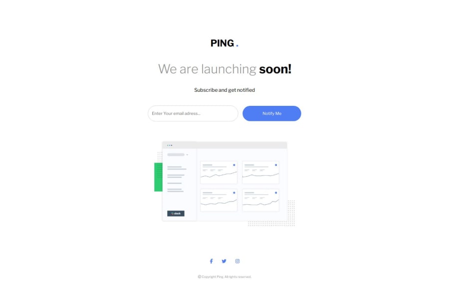
Design comparison
Solution retrospective
i am most proud of the design of this project
What challenges did you encounter, and how did you overcome them?not sure
What specific areas of your project would you like help with?I would like to have help with my caret positioning on the form
and any responsive web design tips will be greatly appreciated .
Please log in to post a comment
Log in with GitHubCommunity feedback
- @mystery832949
I have fixed my email validation but when i commited my changes using git bash to my github account it looks different on the website then my html files. i would greatly apreciate if somone could tell me why
- @mystery832949
hello i have made a fully responsive design for my secound commit. but i still have trouble with email validation if anyone would help me with this it would be greatly appreciated
- @kalebemax
You could try setting the image width to 80%(or less you decide how much will looks better) for the image to adapt to the size of the screen, some margin-top and margin-bottom to the body might be good for the responsiveness.
Join our Discord community
Join thousands of Frontend Mentor community members taking the challenges, sharing resources, helping each other, and chatting about all things front-end!
Join our Discord
