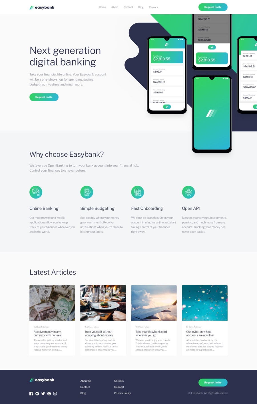
Design comparison
SolutionDesign
Solution retrospective
This was the trickiest project for me because I just could not figure out the background/main img for mobile so I had to reconfigure the whole thing! Can someone please show me a better way, thanks!
Community feedback
- @ir-afnPosted over 4 years ago
Like your solution for the images, it seems to be working fine here. And also like how you used transform for the button :) I also did this challenge and struggled with the images. To avoid positioning two img elements in one block I added the background picture in css through background-image
0
Please log in to post a comment
Log in with GitHubJoin our Discord community
Join thousands of Frontend Mentor community members taking the challenges, sharing resources, helping each other, and chatting about all things front-end!
Join our Discord
