Design comparison
Solution retrospective
Feedbacks are welcome!
Community feedback
- @ApplePieGiraffePosted over 4 years ago
Wow! Your solution looks amazing!
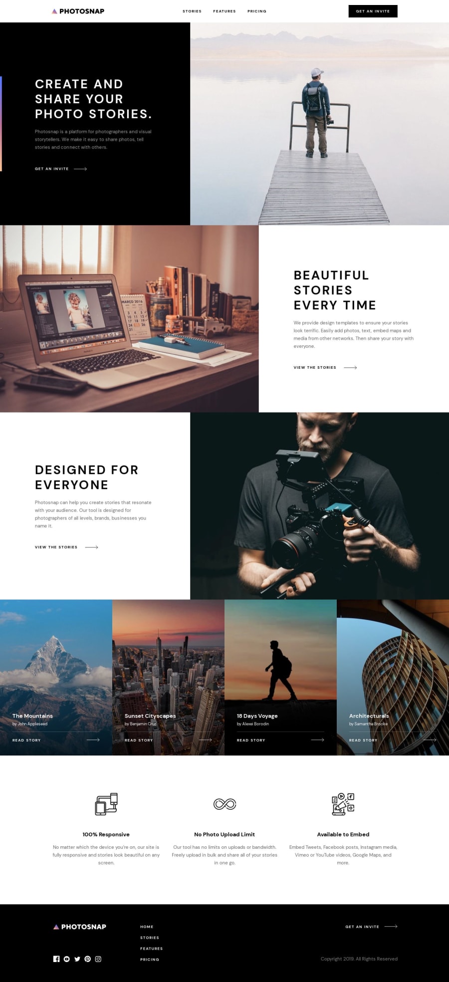
How did you manage to make your solution nearly identical to the original design? My solutions always seem to be slightly too large or small or misaligned in some way!
1@zuolizhuPosted over 4 years ago@ApplePieGiraffe Thank you!
This is not an advertisement🤣, I just want to emphasize how great the design file helps to get the accurate result like this screenshot above😎. This project started with the design system, laying down the font sizes, line heights, letter spacing etc 🤯 (which are given in the sketch file) first and then building the pages.
After I finish a page, I will use a browser plugin called PerfectPixel(https://www.welldonecode.com/perfectpixel/), which you can put the design file overlay on your page, and adjusting the opacity to see the differences between your page and the design file 👀.
You do can use PerfectPixel plugin only to get the ideal result, but using design file + plugin will get the good result faster 🥳.
Hope I explained clearly, happy coding🙌!
4@ApplePieGiraffePosted over 4 years ago@zuolizhu
Thank you for your reply. I'll certainly look into PerfectPixel!
Happy coding to you, too!
1
Please log in to post a comment
Log in with GitHubJoin our Discord community
Join thousands of Frontend Mentor community members taking the challenges, sharing resources, helping each other, and chatting about all things front-end!
Join our Discord
