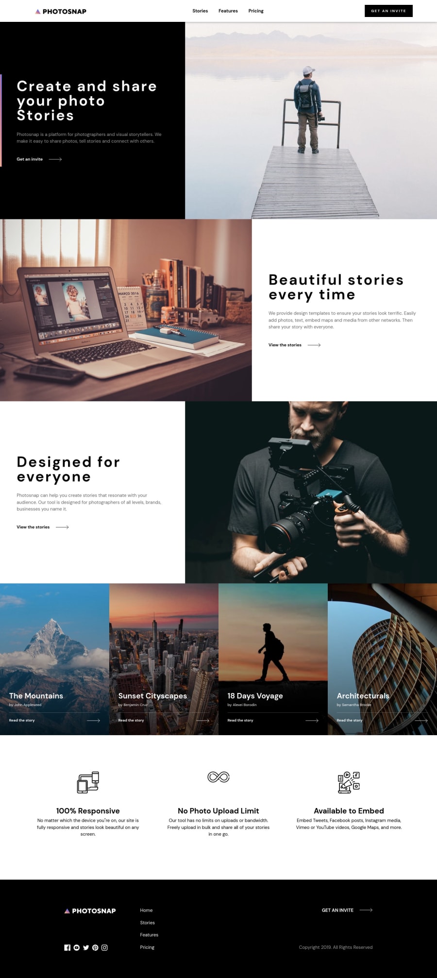
Photosnap Marketing Site using Vue.js, SCSS and Bootstrap 5
Design comparison
Solution retrospective
I would totally appreciate some feedback on the design implementation, especially on the grid system. Also feedback on my component driven approach would be really nice :)
Community feedback
- @isprutfromuaPosted over 2 years ago
Hi there. Good job! Your solution looks very similar to the design.
I have some suggestions for improvement:
-
set text-transform: uppercase for section headers
-
I think it would be better to import page components out of a config
import HomeView from .... .... component: HomeView- For a better UI, you can add smooth transitions between pages. For example:
<transition name="fade"> .... </transition>- I think you could simplify your data file. You could export each page individually, instead of importing an entire data file into single file components.
I hope my feedback will be useful.
Good luck and fun coding 🤝⌨️
Marked as helpful0@lucaspl3ttiPosted over 2 years ago@isprutfromua hey, thank you so much for your feedback!
I will try your suggestions out and look how it will go. I actually didn't even know about the transition tag, so thanks for mentioning that :) Also your advice of breaking down the big single data file is a good one, didn't thought of that while I was working on the project.
0 -
Please log in to post a comment
Log in with GitHubJoin our Discord community
Join thousands of Frontend Mentor community members taking the challenges, sharing resources, helping each other, and chatting about all things front-end!
Join our Discord
