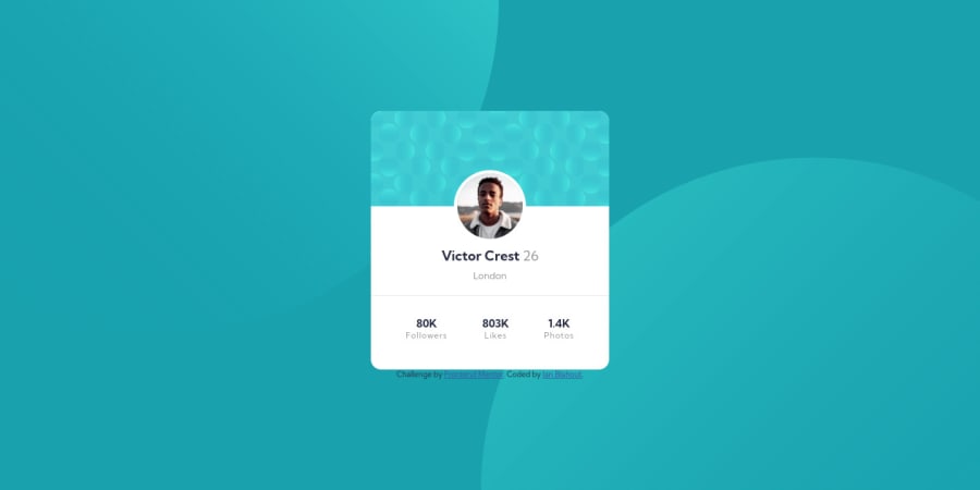
Design comparison
Solution retrospective
Hello,
This challenge seems quite easy at first but got complicated over time. I would need some help explanation. When I am using google chrome and the dev tools- inspect it and go with response, size it down to 375px ,everything sizes down, why? When I open the live page on mobile, it looks just fine. Do you have any tips for this ? I put min width based on width of the provided image.
The second thing I need help with is how to center some things. In this challenge - for example the stats at the bottom (followers, likes,photos). I used flexbox there , justify content, but align content didnt work, because the last section doesnt fill the rest of the card. Is there any way how to center them in the middle of the section except margin / padding ?
The last things i dont know how to do is how to scale down the two images that are in top left and bottom right corners (the circles).
Thank you very much for your feedback ! I appreciate everything.
Kind regards,
Jan Blahout
Community feedback
Please log in to post a comment
Log in with GitHubJoin our Discord community
Join thousands of Frontend Mentor community members taking the challenges, sharing resources, helping each other, and chatting about all things front-end!
Join our Discord
