Submitted 6 months ago
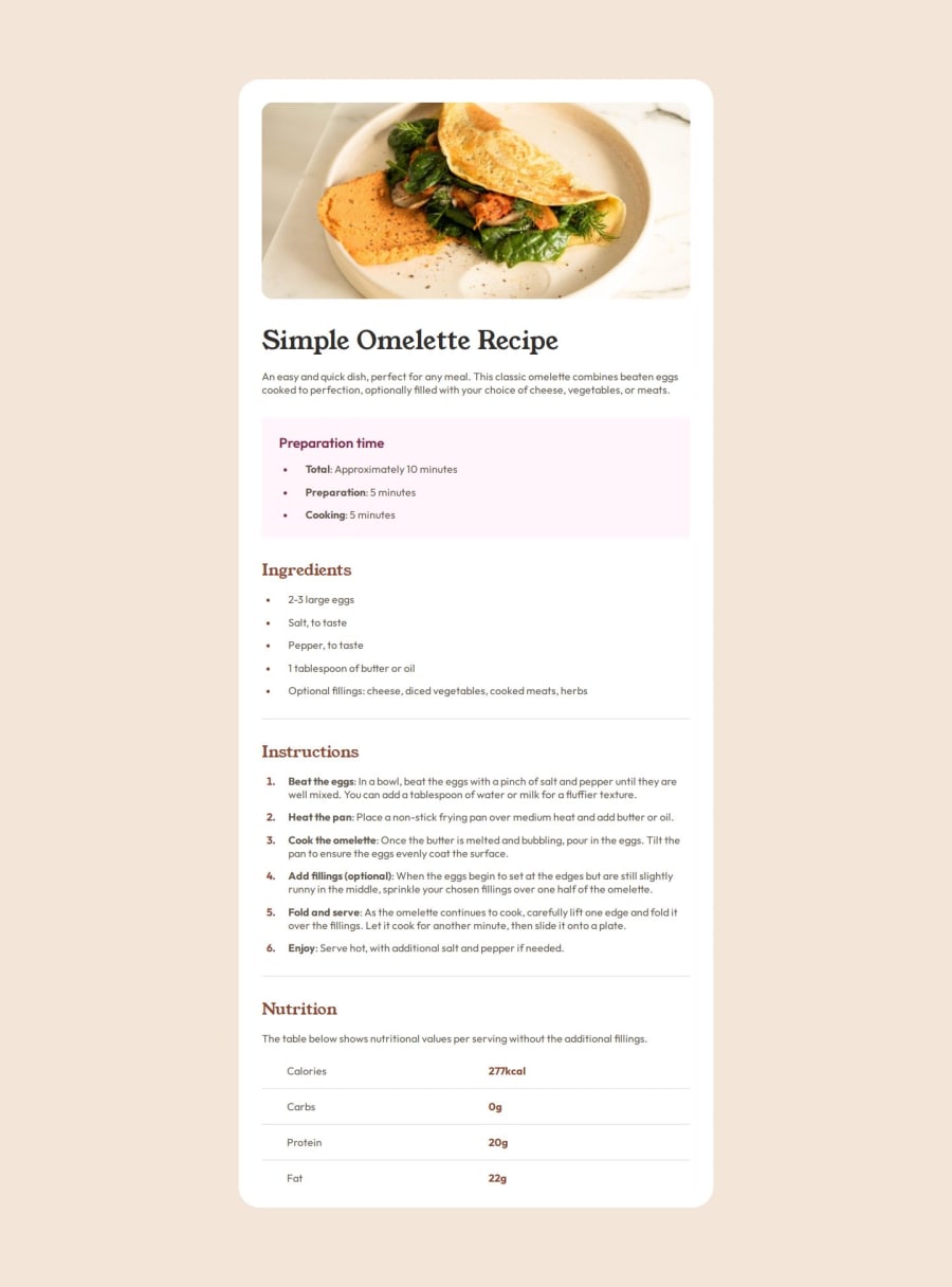
Página responsiva usando tamanhos relativos e @media screen`s
#pure-css
@Iruburu
Design comparison
SolutionDesign
Solution retrospective
What are you most proud of, and what would you do differently next time?
Eu me orgulho de conseguir ter feito de forma que ficasse igual/quase igual, e também por ter ficado bonito. Tentaria fazer de outras comidas e usar variedade de cores.
What challenges did you encounter, and how did you overcome them?Quase não encontrei desafio. Porem tive uma quebra de cabeça com umas das folhas de estilo que criei que estava atrapalhando a responsividade da página.
Community feedback
- @wotanutPosted 6 months ago
An excellent attempt, just a couple of small tweaks:
- Your github repo is private (show it off, it'll look good on your CV)
- You missed a border radius on the preparation time section
Other than that, well done
Marked as helpful0
Please log in to post a comment
Log in with GitHubJoin our Discord community
Join thousands of Frontend Mentor community members taking the challenges, sharing resources, helping each other, and chatting about all things front-end!
Join our Discord
