

Design comparison

Community feedback
- @Youssef-fPosted about 2 months ago
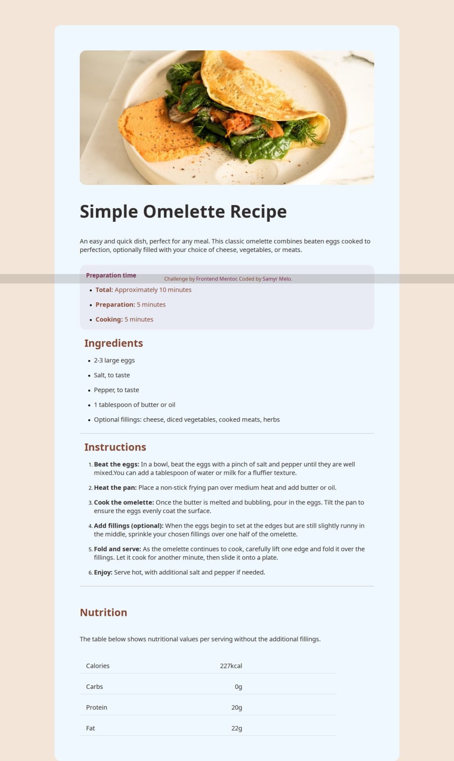
- Improve Accessibility: • Add alt text to images in a more descriptive way (e.g., "A freshly made omelette on a plate" instead of "foto de omelete"). • Use semantic HTML elements like <section> for different sections (e.g., preparation, ingredients, instructions). • Ensure that the <h1> tags are used appropriately. You have multiple <h1> elements; consider using <h2> or <h3> for subsections.
Use Consistent Class Naming: • Some class names are in English (.receita, .ingredientes), while others are mixed (.instrucao). Standardizing the names (all in English or all in Portuguese) improves readability.
CSS Feedback: 1. Improve Consistency in Spacing & Alignment: • The .preparacao section’s text alignment is set to justify, but this may not be necessary. Centering or left-aligning text could look better in smaller screens. • The .calories div has gap: 350px, which is too large for smaller screens. Use flex-wrap: wrap; for better responsiveness. 2. Enhance Mobile Responsiveness: • The .calories section may overflow on smaller screens. Adjust the padding: 28px 300px 10px 20px; to be responsive using @media queries. • The .receita h1 font size is quite large. Use clamp(32px, 5vw, 55px); to make it more adaptable. 3. Fix Footer Positioning: • Your footer is position: fixed; but this can overlap content on smaller screens. Consider using position: relative; or sticky.
0

Please log in to post a comment
Log in with GitHub
Join our Discord community
Join thousands of Frontend Mentor community members taking the challenges, sharing resources, helping each other, and chatting about all things front-end!
Join our Discord