Submitted almost 2 years ago
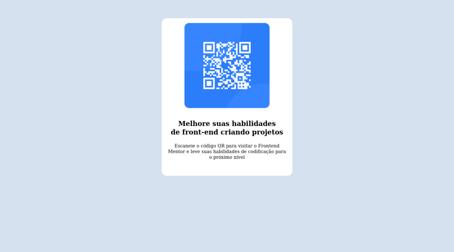
Página com um QR Code, usando apenas HTML e CSS

@JuliaGCB

Design comparison
SolutionDesign

Solution retrospective
A parte mais difícil, foi centralizar os componentes no meio da tela.
Community feedback
Please log in to post a comment
Log in with GitHub
Join our Discord community
Join thousands of Frontend Mentor community members taking the challenges, sharing resources, helping each other, and chatting about all things front-end!
Join our Discord