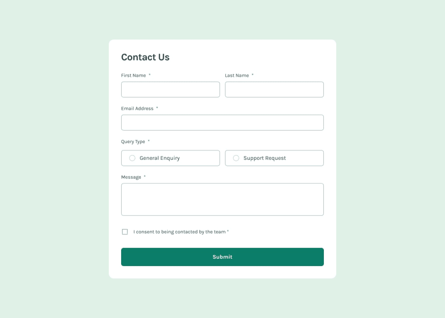
Design comparison
Solution retrospective
I'm most proud of the clean and responsive design of my HTML and CSS code, ensuring it works well across various devices and screen sizes. Next time, I would optimize the JavaScript further to improve efficiency and readability, and also consider implementing more comprehensive form validation to enhance user experience.
What challenges did you encounter, and how did you overcome them?One of the challenges I encountered was integrating the provided error messages smoothly within the form validation logic. Ensuring that the predefined messages appeared at the right time and in the correct context required careful coordination between HTML, CSS, and JavaScript. I overcame this by setting up clear conditions in the JavaScript code and using CSS to control the visibility and styling of the messages. Another challenge was maintaining a consistent look across different browsers. To address this, I tested the form extensively in multiple browsers and made necessary adjustments to the CSS.
What specific areas of your project would you like help with?I would appreciate help with optimizing the JavaScript code, particularly in improving the efficiency of the form validation process. Specifically, I'm looking for feedback on how to handle multiple conditions and error messages in a more streamlined manner. Additionally, I'd like advice on making the CSS more modular and maintainable, particularly regarding the responsiveness of the design. Suggestions on how to better organize my CSS and possibly use a preprocessor like SASS would be very helpful.
Community feedback
Please log in to post a comment
Log in with GitHubJoin our Discord community
Join thousands of Frontend Mentor community members taking the challenges, sharing resources, helping each other, and chatting about all things front-end!
Join our Discord
