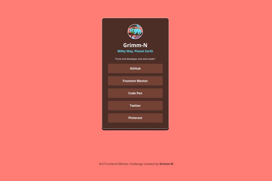
Design comparison
Solution retrospective
HTML: Pretty stoked about how the code stays neat and easy on the eyes. If you’ve got any tips for making it even slicker, hit me up!
CSS: Dabbled in both Grid and Flexbox this time around. Nothing earth-shattering here, just getting comfy with % and rem. It’s like I’m leveling up in CSS or something.
What challenges did you encounter, and how did you overcome them?So, I decided to flex my creative muscles and cook up my own layout style for this one. It turns out designing from scratch takes way more time than just picking a pre-made template. Who knew?
I turned to Adobe Photoshop for some RGB magic to nail those perfect shades. Gotta love those color choices!
What specific areas of your project would you like help with?No major hiccups on this ride, but I’m all ears for any critiques or pro tips you might have. Let’s make it even better!
Community feedback
- @Taninwat-55Posted 7 months ago
I like the idea that you've adapted it to your own design while maintain the same layout!
0
Please log in to post a comment
Log in with GitHubJoin our Discord community
Join thousands of Frontend Mentor community members taking the challenges, sharing resources, helping each other, and chatting about all things front-end!
Join our Discord
