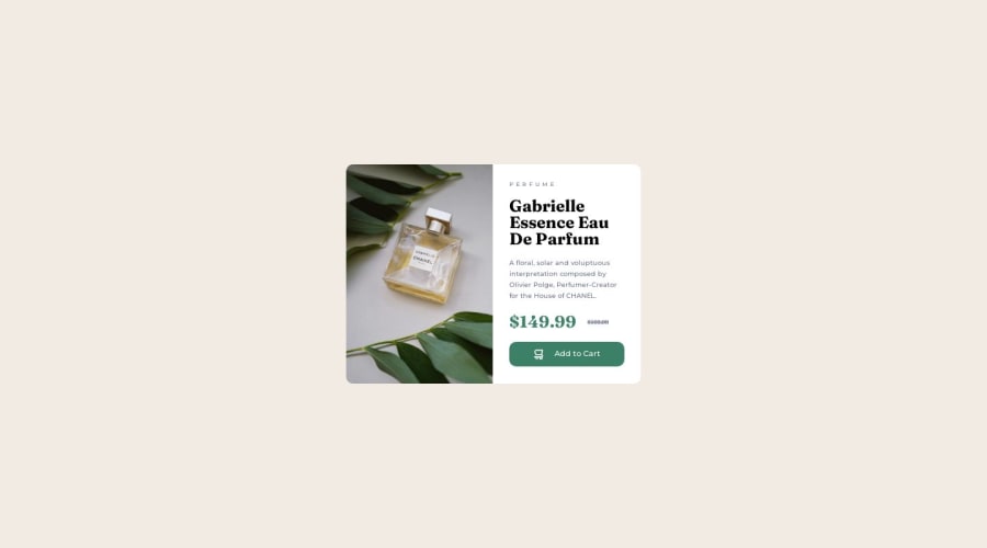


Design comparison

Solution retrospective
Hello, looking for feedback When i learned css i never used rem/em and vh/vw so this is a first time. Also i think I'm using unnecessary classes. Let me know if there was a more optimal way to write my html and css.
PS: Still have to do mobile version i just wanted to have some feedback first.
Community feedback
- @itushPosted over 1 year ago
Congratulations on submitting your desktop only solution! 🎉
-
In my projects I try to use relative units as much as possible and avoid absolute units wherever I can.
-
Feel free to checkout my product preview project code and notice how I handle responsiveness with mobile and desktop product images.
-
I remember when I started out, I made countless mistakes and spent long hours searching for solutions. But hey, you don't need to go through the same struggles! 🙌 To help you shorten the learning curve, I recommend going through the following articles. They contain valuable insights that can make your journey smoother:
📚🔍 12 important CSS topics where I discuss about css position, z-index, box-model, flexbox, grid, media queries, mobile-first workflow, best practices etc. in a simple way.
I hope you find these resources helpful in your coding adventures! 🤞
I'm eagerly looking forward to seeing the amazing projects you'll create in the future! 🚀💻
Keep up the fantastic work and happy hacking! 💪✨
Marked as helpful1 -

Please log in to post a comment
Log in with GitHub
Join our Discord community
Join thousands of Frontend Mentor community members taking the challenges, sharing resources, helping each other, and chatting about all things front-end!
Join our Discord