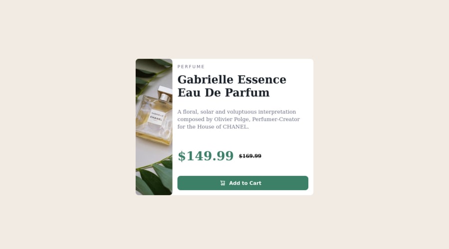
Design comparison
Solution retrospective
Hi, I would like to know if there is a better way to show and hide pictures at special screen sizes. Also I didn't know how to make a borderradius e.g. only at the left top.
Thanks for everyone answering
Hugs from Germany
Community feedback
- @AdrianoEscarabotePosted about 2 years ago
Hi Konstantin Christ, how are you? I really liked the result of your project, but I have some tips that I think you will enjoy:
images must have alt text unless it is a decorative image, for any decorative image each IMG tag must have empty
alt=""
and addaria-hidden="true"
attributes to make all the assistive technologies of the Web, as screen reader. Learn the differences between decorative/meaningless images vs important content.If we see how the layout is behaving at higher resolutions, with the help of google dev tools, we will see that it is stretching a lot, to solve this we can use a
max-width
with the value we want the content to stop growing and to center use amargin: 0 auto;
every Html document must contain the main tag, so we can identify the main content, to fix this, wrap the main content with the main tag. HTML5 landmark elements are used to improve navigation experience on your site for users of assistive technology.
The rest is great!
I hope it helps... 👍
Marked as helpful0@KonstantinchristPosted about 2 years ago@AdrianoEscarabote thanks man appreciate that
0 - @VCaramesPosted about 2 years ago
Hey there! 👋 Here are some suggestions to help improve your code:
-
It is best practice to use, Classes for your naming convention as classes are reusable, making them ideal for CSS styling. IDs on the other hand, are not reusable and are mainly used for JavaScript.
-
To not only improve your HTML code but to also identify the main content of you page, you will want to wrap your entire component inside the
Main
Element. -
The image’s
Alt Tag
description needs to be improved upon to better describe what it is. You will want to assume that you are describing the image to a someone. -
This component requires the use of two images 🎑 at different breakpoints. The
Picture
element will facilitate this.
Here is an example of how it works: EXAMPLE
Syntax:
<picture> <source media="(min-width: )" srcset=""> <img src="" alt=""> </picture>
More Info:
https://www.w3schools.com/html/html_images_picture.asp
https://web.dev/learn/design/picture-element/
-
The only heading in this component, is the name of the perfume; “Gabrielle Essence Eau De Parfum” . The rest of the text should be wrapped in a
Paragraph
element. -
Currently, the old price (169.99) 🏷 is not being properly announced to screen readers. To fix this, you are going to wrap the the price in a
Del
Element and inside it you will add aSpan
Element with an sr-only class that will state something like “The previous price was…” and use CSS to make it only visible to screen readers.
If you have any questions or need further clarification, feel free to reach out to me.
Happy Coding! 🍂🦃
Marked as helpful0@KonstantinchristPosted about 2 years agoHi @vcarames, I just asked myself how you get the sizes of the items so accurate compared to the design.
0@VCaramesPosted about 2 years ago@Konstantinchrist
If you have the Figma files it easy but if not, you will have to compare and have the design file on top of your file and try to match it by eye.
0 -
Please log in to post a comment
Log in with GitHubJoin our Discord community
Join thousands of Frontend Mentor community members taking the challenges, sharing resources, helping each other, and chatting about all things front-end!
Join our Discord