Design comparison
Solution retrospective
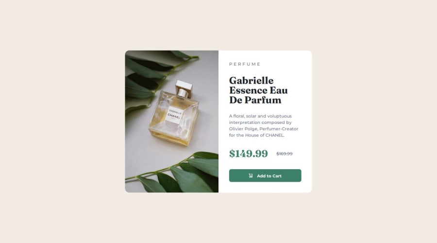
This challenge really got me to figure out using grid and flex box for nice, evenly spaced layouts. I am also really happy with the time this took me: no more than 2 hours of coding. I also think my abilities to judge sizes and text styles (especially the actual CSS properties which produce certain appearances) is improving.
What challenges did you encounter, and how did you overcome them?It took me a while to realise that using margins on everything was not a smart way to create a good-looking responsive layout, and eventually I settled on using flex box to align and space all of the text elements in this design.
What specific areas of your project would you like help with?I am still unsure about general best practice for media query breakpoints, and whether it's important to consider certain atypical layouts for a given project (in this case, landscape orientation for mobile). Any advice on how others think through this would be great.
Community feedback
Please log in to post a comment
Log in with GitHubJoin our Discord community
Join thousands of Frontend Mentor community members taking the challenges, sharing resources, helping each other, and chatting about all things front-end!
Join our Discord
