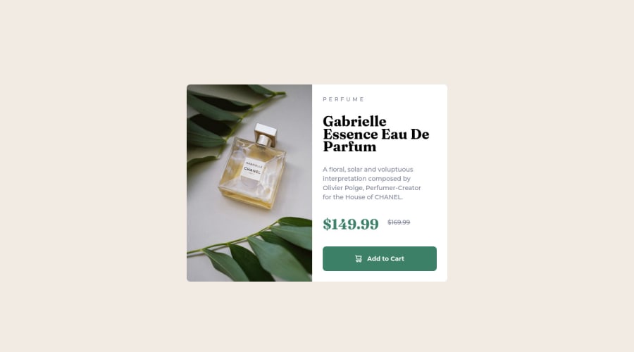
Design comparison
Solution retrospective
This one took me a around 5 hours. Surprisingly hard.
Community feedback
- @visualdennissPosted over 1 year ago
Congrats on completing the challenge successfully! It looks great on both mobile and desktop devices and is responsive. However these is a suggestion i would like to make. The image seems to be distorted a bit, because of the aspect ratio of width and height. To handle this you can add object-fit:cover;
.imgdesktop { display: flex; height: 100%; object-fit: cover; }
Hope you find this feedback helpful!
Marked as helpful0@waffleflopperPosted over 1 year ago@visualdenniss came here to say this. The desktop version the picture was squashed. When I was looking at the html and css I saw that the media query puts the card in a flex mode. So I was going to suggest putting a
flex: 1on the content container and image container so they shared the space equally, since it looked like it's suppose to be a 50/50 split between the two (for desktop).Marked as helpful0 - @waffleflopperPosted over 1 year ago
I like how you formatted out your CSS styling, with the comments about what each was doing before writing all the layout styles and such. I'm an in-progress self-taught looking to start a career in the field in about a year and was wondering where you picked this method up? I'm always on the lookout to for new practices to implement =)
Nice work =)
1@JoPantaPosted over 1 year ago@waffleflopper hi! That is called css reset. There's lots of them, bit i used this one. https://www.joshwcomeau.com/css/custom-css-reset/
1
Please log in to post a comment
Log in with GitHubJoin our Discord community
Join thousands of Frontend Mentor community members taking the challenges, sharing resources, helping each other, and chatting about all things front-end!
Join our Discord
