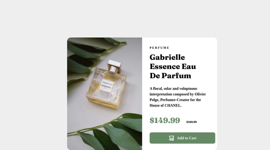
Design comparison
Solution retrospective
Thoughts ?
Community feedback
- @HassiaiPosted over 1 year ago
Replace <div class="container"> with the main tag, <p class=two> with <h1> to make the content/page accessible. click here for more on web-accessibility and semantic html
Every html must have <h1> to make it accessible. Always begin the heading of the html with <h1> tag wrap the sub-heading of <h1> in <h2> tag, wrap the sub-heading of <h2> in <h3> this continues until <h6>, never skip a level of a heading.
Give the alt attribute in the img a descriptive value instead of #. The value of the alt attribute is the description of the image. For decorative images like icons, there is no need to give it an alt value, for more on alt attribute Click here.
The body has a wrong background-color. Use the colors that were given in the styleguide.md found in the zip folder you downloaded.
To center .container on the page using flexbox or grid instead of margin,
- USING FLEXBOX: add min-height:100vh; display: flex; align-items: center: justify-content: center; to the body
body{ min-height: 100vh; display: flex; align-items: center; justify-content: center; }- USING GRID: add min-height:100vh; display: grid place-items: center to the body
body{
min-height: 100vh;
display: grid;
place-items: center;
}
Use relative units like rem or em as unit for the padding, margin, width values and preferably rem for the font-size values, instead of using px which is an absolute unit. For more on CSS units Click here and here
You forgot to add a media query for the mobile design. For more on media queries, click here
Hope am helpful.
Well done for completing this challenge. HAPPY CODING
Marked as helpful0 - @bhoamikhonaPosted over 1 year ago
The card is not centered, the active states are not working, need to use semantic HTML, and it is not responsive. Need to at
alt=""to images.HTML
- You need to use semantic HTML. When we talk about semantics, it means that certain elements have a meaning or a purpose attached to them. You can learn more about it here: https://www.w3schools.com/html/html5_semantic_elements.asp
CSS
-
Use pseudo class
:hoveron your button for active states. -
You can learn more about it here: https://www.w3schools.com/cssref/sel_hover.php
-
Your layout needs to be responsive i.e. the design needs to adapt to multiple screen sizes. Might want to use media queries for it.
-
Learn more about it here: https://www.w3schools.com/css/css_rwd_mediaqueries.asp
Accessibility
- You need to add
altproperty values to all the images as accessibility allows disabled people to navigate the website better. - You can learn all about accessibility here: https://developer.mozilla.org/en-US/docs/Learn/Accessibility/What_is_accessibility
Feel free to ask if you have any questions.
Here is my solution for this challenge, hope it helps: https://www.frontendmentor.io/solutions/perfume-product-card-project-ajFg9WZ6i_
Marked as helpful0
Please log in to post a comment
Log in with GitHubJoin our Discord community
Join thousands of Frontend Mentor community members taking the challenges, sharing resources, helping each other, and chatting about all things front-end!
Join our Discord
