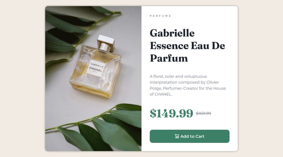
Design comparison
SolutionDesign
Solution retrospective
What are you most proud of, and what would you do differently next time?
I feel good with the results obtained, for the moment I would not make any other improvements.
What challenges did you encounter, and how did you overcome them?I had complications with setting the font size according to the device size, as a solution I used the 'clamp' method to manage minimum and maximum sizes of both the containers and the font sizes, I did not have the need to use Media Queries.
Please log in to post a comment
Log in with GitHubCommunity feedback
No feedback yet. Be the first to give feedback on Jorge's solution.
Join our Discord community
Join thousands of Frontend Mentor community members taking the challenges, sharing resources, helping each other, and chatting about all things front-end!
Join our Discord
