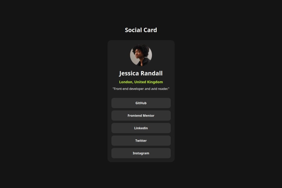
Perfil Social con React and Typescript
Design comparison
Solution retrospective
I am most proud of the component modularity achieved in this project. The Card, Profile, and CallToAction components are reusable, clean, and follow best practices in React development. This structure allowed me to easily add, remove, or modify parts of the card without affecting other areas. However, next time, I would focus on improving state management by incorporating React hooks, such as useState or useContext, to handle dynamic data more effectively. Instead of hardcoding values, I would retrieve user profiles and social links from an external API, allowing the card to be more dynamic and adaptable.
One challenge I encountered was handling CSS specificity and ensuring that styles applied correctly to each component. At times, styles conflicted or overrode each other. To overcome this, I used BEM (Block Element Modifier) naming conventions and scoped the styles within each component file. Additionally, using component-specific CSS files helped avoid global style conflicts. Another challenge was managing static assets like the avatar image, which I resolved by properly configuring file paths and ensuring they were bundled correctly in the build process.
What specific areas of your project would you like help with?I would like assistance in implementing more advanced CSS techniques, such as animations or transitions, to enhance user interaction. Additionally, help with improving the project’s state management, especially handling asynchronous data from an API, would be valuable. I'd also appreciate guidance on how to better test components using Jest or Testing Library to ensure the robustness of the application as it grows.
Community feedback
Please log in to post a comment
Log in with GitHubJoin our Discord community
Join thousands of Frontend Mentor community members taking the challenges, sharing resources, helping each other, and chatting about all things front-end!
Join our Discord
