Perfect React Js Contact Form 👌👌
Design comparison
Solution retrospective
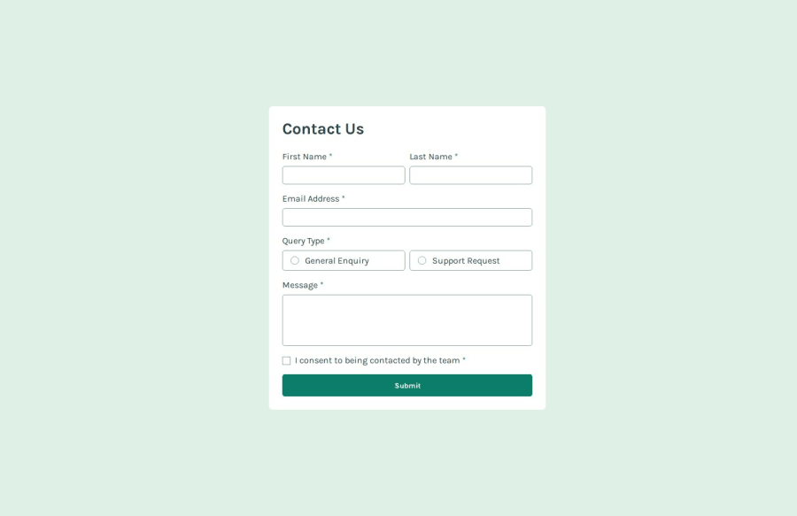
Perfect challenge that made me dive more in React Js with Vite, use of useful dependencies like Formik, Yup & React-Toastify which I customized it 😊.
Also, the custom radio input part was lovely. 👌
Thanks FrontendMentor, kindly give us more and more 👏
What specific areas of your project would you like help with?Maybe additions and subtractions to the solution would be great.
Don't forget to give it a Like and Comment Mahn. ❤
HAVE A NICE CODING JOURNEY AHEAD! 🤞
Please log in to post a comment
Log in with GitHubCommunity feedback
- @jjdavenport
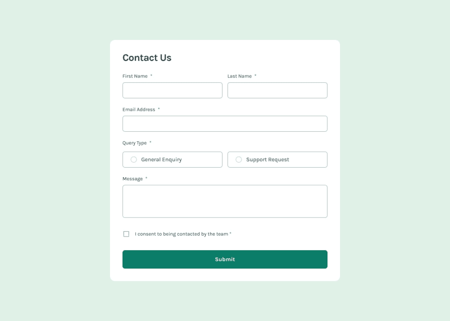
The site look pretty much identical to the original deisgn on both mobile and desktop views, as the site is built in react I cannot read the HTML however it validates the form how you would expect. It includes some improvements over the original deisgn like the error states for the radio buttons and the ability to dismiss the success message. Two impovements could be made to this site, the first to improve accessibility, the ability to tab onto the radio buttons and have them focus, the second is the problem with verticle and horizon overflow making the site scrollable when there is no need.
Well done!
Marked as helpful
Join our Discord community
Join thousands of Frontend Mentor community members taking the challenges, sharing resources, helping each other, and chatting about all things front-end!
Join our Discord
