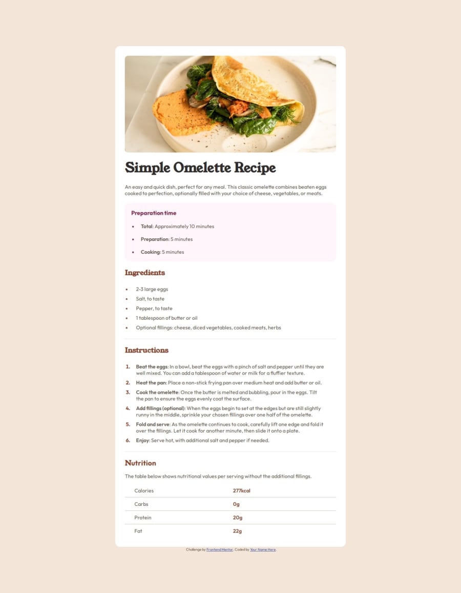
Design comparison
Solution retrospective
In this project, I'm most proud of the clean, semantic HTML and responsive design that adapts well to various screen sizes. The code is well-structured, making it easy to maintain and extend. However, next time I would focus more on accessibility by enhancing keyboard navigation and screen reader support. I'd also like to explore more advanced CSS techniques, such as combining Grid with Flexbox, to create more complex layouts. Additionally, I would aim to optimize performance further by minimizing file sizes and exploring lazy loading. Lastly, adding more interactive JavaScript features could enhance the overall user experience.
What challenges did you encounter, and how did you overcome them?During this project, one of the main challenges I encountered was achieving a fully responsive layout without relying heavily on CSS Grid or Flexbox, as I aimed to stick to traditional layout techniques. This made it difficult to align elements consistently across different screen sizes. To overcome this, I carefully structured my HTML, using percentage-based widths, relative units like em and rem, and media queries to ensure the layout adapted well. Another challenge was ensuring accessibility while maintaining a visually appealing design. I addressed this by thoroughly testing the page with screen readers and refining the HTML structure to be more semantic.
Please log in to post a comment
Log in with GitHubCommunity feedback
- @dzerdzul
👍
Join our Discord community
Join thousands of Frontend Mentor community members taking the challenges, sharing resources, helping each other, and chatting about all things front-end!
Join our Discord
