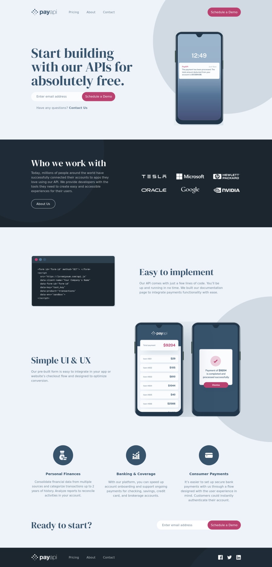
pay-api (React, React-router-6, Tailwind CSS, Scss, CSS Grid)
Design comparison
Solution retrospective
Any and all type of feedback would be greatly appreciated, thank you!
Community feedback
- @fazzaamiarsoPosted about 2 years ago
Hi David! Great Work!
I have an important fix for you. An
inputfield must have alabel. That's important for assistive technology users. But, you may be wondering, where to put the label? since there are only placeholder.You can visually hide the
label, but still accessible by screen readers using tailwind'ssr-onlyclass.For example
<div className="w-full grid gap-2">
      // ✅ Label will be visually hidden
       <label htmlFor="name" className="sr-only">Name</label>
        <input
          id="name"
          className=""
          type="text"
          placeholder="Name"
        />
      </div>
I hope it helps! Cheers!
Marked as helpful1@David-Henery4Posted about 2 years ago@fazzaamiarso Hi Fazzaa thanks for the feedback
I didn't know we have to include a label for screen readers, accessibility is an area I need to improve on and I'm definitely going to be remembering and using this information going into future projects.
Thank you again for the feedback though fazzaa, I very much apprenticed thank you!
0 - @catherineisonlinePosted about 2 years ago
HI! Your solution looks nice though there are a couple of things you can improve which I hope will be helpful! 😊
I would add some transitions for active states (when colors change on hover). It creates more interactivity and makes the project look cooler. Active states can be done on buttons, links, titles which act like links, or anything else, you choose.
You can read more about it here, in case you haven’t done much of it: https://www.w3schools.com/css/css3_transitions.asp
The image with the alt "personal-finances", "banking-coverage", "consumer-payments" should be used more as a decorative image, rather than being attached to any content.
Alt attribute for the image is important in order to specify alternative text for the image in case it will not be displayed. Using alt attribute is good for not only accessibility but also SEO and for situations when the image is loading too slowly. If the image is just for decoration you can still write an alt attribute but leave it empty, such images don’t need any alt tag but you will need to also add aria-hidden=“true”. What aria-hidden does is that it removes the entire element from the accessibility tree.
If otherwise, you need to use an alt tag to describe the image. To write an alt tag you need to describe the content and purpose of the image and try not to use words like “picture of” or “image of”.
Marked as helpful1@David-Henery4Posted about 2 years ago@catherineisonline Hi Catherine, thanks for the feedback
I didn't even think of using the active state on the buttons but I have just now added them to the project and they make it look a lot better and I don't know why I haven't used them until now and I'm definitely going to be using this going forward in my next projects.
I also didn't know about handling decorative images with alt differently to regular images, I can see why though because it doesn't really add substantial to the content and doesn't need to be described.
Again thank you for the feedback, these are two things I didn't know about and will definitely be taking this information into my future projects, and thanks again for the feedback its massively appreciated thank you! 👍
0
Please log in to post a comment
Log in with GitHubJoin our Discord community
Join thousands of Frontend Mentor community members taking the challenges, sharing resources, helping each other, and chatting about all things front-end!
Join our Discord
