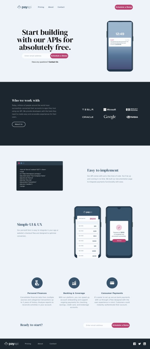
Submitted over 2 years agoA solution to the PayAPI multi-page website challenge
PayAPI Multi-Page Website
next, react, tailwind-css, typescript
@theidriselijah

Solution retrospective
Overall I found this project easy to build. The only thing I couldn't figure out was how to add the circles to the page without interfering with what's on the page, such as the navbar component. Hopefully, I figure it out down the line, but for now, I'm very pleased with the work that I did here. Any general feedback is always welcomed, or questions you may have.
Code
Loading...
Please log in to post a comment
Log in with GitHubCommunity feedback
No feedback yet. Be the first to give feedback on Idris Elijah's solution.
Join our Discord community
Join thousands of Frontend Mentor community members taking the challenges, sharing resources, helping each other, and chatting about all things front-end!
Join our Discord