Submitted almost 2 years agoA solution to the PayAPI multi-page website challenge
PayAPI
react, next
@Lordyner

Solution retrospective
Hello everyone,
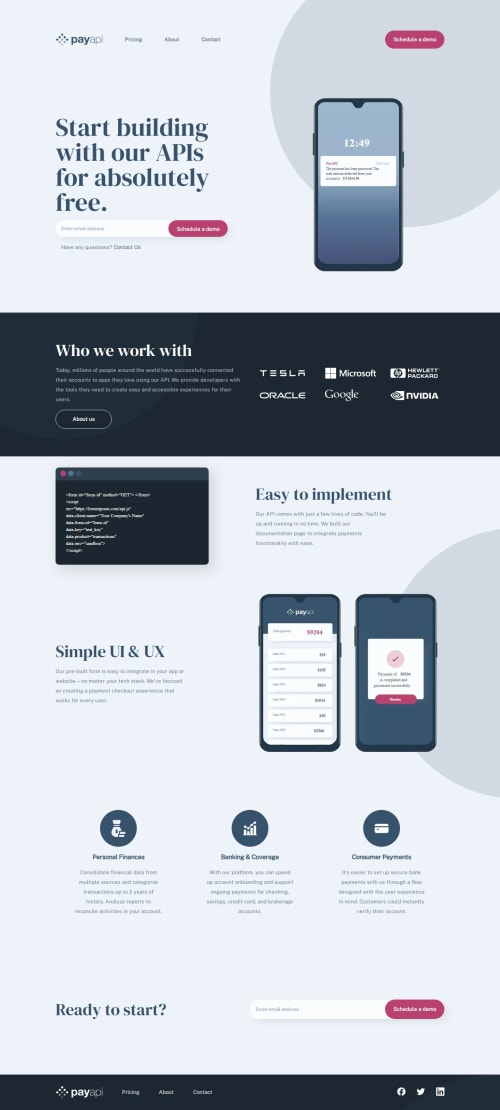
Here my solution to the PayAPI challenge. I have mainly struggle with those background circle svg and how to set them properly for the different screen sizes.
So if you have a better practices for how to position them, I would love to hear it. Or if you have any feedback on my solution, feel free to tell me !
Code
Loading...
Please log in to post a comment
Log in with GitHubCommunity feedback
No feedback yet. Be the first to give feedback on André-Lubin Thomas's solution.
Join our Discord community
Join thousands of Frontend Mentor community members taking the challenges, sharing resources, helping each other, and chatting about all things front-end!
Join our Discord