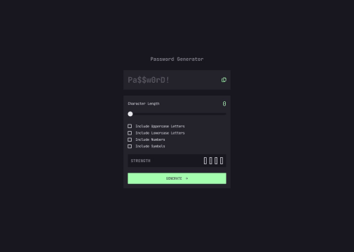
Password Generator Solution

Solution retrospective
There was a lot going on with this one so I took my time with each little thing and really focused on the getting it functioning properly and looking like the design.
What challenges did you encounter, and how did you overcome them?The slider was the first challenge, getting it to turn green as it moved, then the checkbox styling with the check icons was a whole other challenge, then getting the strength boxes working correctly was tough too. I just kept at it, did more research and got help from the community as I went along.
What specific areas of your project would you like help with?I think I'm good on this one, but any feedback is welcome.
Please log in to post a comment
Log in with GitHubCommunity feedback
No feedback yet. Be the first to give feedback on Matt Cope's solution.
Join our Discord community
Join thousands of Frontend Mentor community members taking the challenges, sharing resources, helping each other, and chatting about all things front-end!
Join our Discord