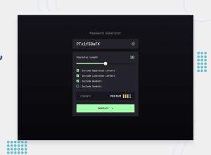
Design comparison
Solution retrospective
In this project, I incorporated several aesthetic features that I find particularly appealing, such as the falling characters that represent both the length of the password (by changing the number of letters) and the selected character types. Additionally, I included a rotating letters effect when creating a new password, simulating a hacker-style effect.
Unfortunately, the website only functions as intended in WebKit-based browsers (such as Chrome). As I had already invested a significant amount of time implementing these extra features, I decided to move forward. In future projects, I aim to prioritize adding broader web support, particularly focusing on ensuring compatibility with custom input sliders and the falling characters effect.
What challenges did you encounter, and how did you overcome them?My main learning experience from this project stemmed from using TypeScript for the first time and managing various types across a modular app, including components, data, and utility functions.
What specific areas of your project would you like help with?I am open to receiving recommendations for optimizing the effects and improving file and logic organization. I believe there is room for improvement in both areas and would appreciate any insights or suggestions.
Community feedback
Please log in to post a comment
Log in with GitHubJoin our Discord community
Join thousands of Frontend Mentor community members taking the challenges, sharing resources, helping each other, and chatting about all things front-end!
Join our Discord
