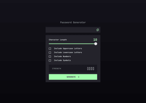
Design comparison
Solution retrospective
I had a lot of trouble styling the range input, spent way too much time on that 😅 but i got it at last.
Community feedback
- @gmagnenatPosted 3 months ago
Hi there, congrats on completing the challenge!
I just finished it as well; it was a tough one.I noticed a few things in your challenge that you may want to check to improve your solution.
-
There is a problem with focusable elements, making it tricky to use for keyboard-only users. You added a
display: none
on your checkbox. With that, we cannot reach these checkboxes using a keyboard as they become non-focusable.Instead, you can use
appearance: none
and custom style them as you want. You will keep the native behavior of the element. Checkboxes have a:checked
state that you can use to style with the custom SVG. -
You also removed the outline on the range slider. It's not possible to notice when this element is in focus.
-
For better accessibility, instead of adding large padding to your body to size your content, I recommend you use a
max-width
on yourmain_card
and center the content in the body with Flexbox. You'll need to remove thewidth: 100vw
, which is unnecessary and can cause issues. This is important to let users who need to zoom in on the page have a good experience too.
I hope you find something useful in my comments. Let me know if you have any questions.
Happy coding!
Marked as helpful1 -
Please log in to post a comment
Log in with GitHubJoin our Discord community
Join thousands of Frontend Mentor community members taking the challenges, sharing resources, helping each other, and chatting about all things front-end!
Join our Discord