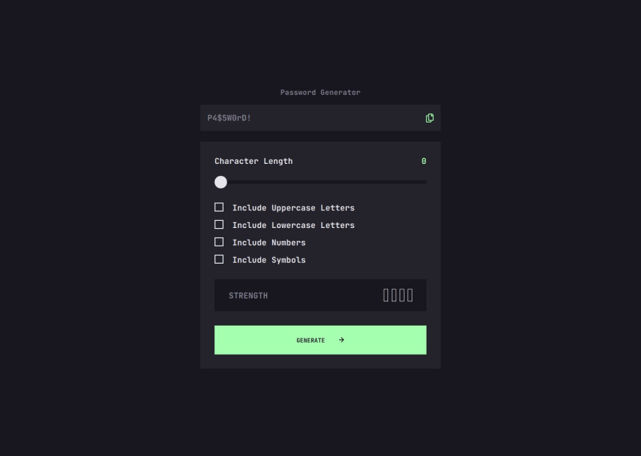
Design comparison
Solution retrospective
I am proud to have been able to customise the slider as well the copy clipboard option. This project seemed easy at first glance but after starting i learned a lot. It was great :)
What challenges did you encounter, and how did you overcome them?I had trouble realising the slider but after several searches i was able to do it. I use tactile events touchstart
and mousedown
etc....
I would like to know how yo change the colour of a SVG because when i target it with CSS it doesn't work. That way i could add the options hover
index.html
SVG
.header-icon:hover {
color: var(--almost-white);
}
Community feedback
- @djneillPosted 3 months ago
I used React & Tailwind but I'm sure you can accomplish the same with HTML & CSS. Instead of using an image tag for the check mark put the SVG inline and remove the fill="#000". You should then be able to target it with your CSS class. Here's an example of how I did it.
<svg width="12" height="12" xmlns="http://www.w3.org/2000/svg" className="ml-2 transition-colors group-hover:fill-[#A4FFAF]" > <path d="m5.106 12 6-6-6-6-1.265 1.265 3.841 3.84H.001v1.79h7.681l-3.841 3.84z" className="fill-current" />
0 - @HexersePosted 3 months ago
Looks great ! Though for the media queries. I think that you don't need to do so much because the app itself is not that big. Also you should use percentages instead of static values. For example width:100% will follow its container as it grows smaller !
You could also make some of the js code like the uppercase and lowercase letters into a dictionary or objects. For easier extraction later on !
I think the code is abit hard to read because its many small pieces of information everywhere. So I am abit confused when giving feedback. Hope this helps
0
Please log in to post a comment
Log in with GitHubJoin our Discord community
Join thousands of Frontend Mentor community members taking the challenges, sharing resources, helping each other, and chatting about all things front-end!
Join our Discord