Password Generator App with Added Accessibility (Typescript/Vite)
Design comparison
Solution retrospective
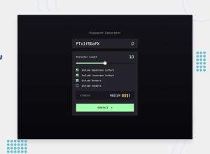
Here is my solution to the project. I have made a few modifications to the original design:
- The "generate" button is disabled if either all the boxes are unchecked or the password length is 0.
- Instead of the word "copied" showing beside the clipboard button (which could possibly be an issue with a longer password), a toast notification will display when the password is copied to clipboard.
- The password strength meter calculates the password strength as the user sets options, so the user already knows the password strength before generating the password.
I also added additional CSS rules so that if the user has forced colors (high contrast) active, the form controls and buttons will still display well.
I did have quite a bit of difficulty with styling the slider. I was not able to get the left side of the bar to show as green without running into other display glitches. Since it does not affect functionality and is not a major visual problem, I'm submitting the solution, but I may revisit the problem sometime later. Any suggestions on styling the range input, or any other suggestions for improvement, are welcome.
Community feedback
Please log in to post a comment
Log in with GitHubJoin our Discord community
Join thousands of Frontend Mentor community members taking the challenges, sharing resources, helping each other, and chatting about all things front-end!
Join our Discord
