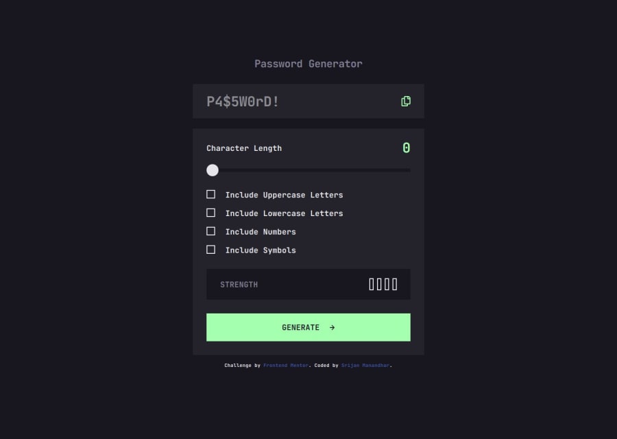
Password generator app using web components
Design comparison
Solution retrospective
I learned how to,
- Pass the text to the custom web components. And this was possible by adding element in the CustomCheckbox component.
- use CSS pseudo selector :nth-child to show the strength meter bars and apply colors to it. I had some idea about passing number to nth-child which selects the corresponding child of an element. However, the use of :nth-child(-n + 2) was new to me, and it was really helpful for this case.
- set internal states to the custom web components and make use of those pseudo selectors in CSS to apply different styles.
- use RegExp constructor method to match the generated password and calculate the strength.
I had some issue making the custom range slider.
- Adding CSS to the built in input['range'] was too time consuming and it was not looking like in the design. So, I decided to make custom range slider.
- To make it work I had to handle events like mousedown, mousemove and mouseup. - And based on the width of the slider track and screen position of the thumb, we need to calculate the left or right movement based on how much the thumb was dragged across.
- And then I calculated the percentage of the movement to set value based on the max attribute of the default range slider.
- Similar, events listener for touch enabled devices were also done using touch events like touchstart, touchmove and touchend.
Open for feedback
Community feedback
- @matbac85Posted 9 months ago
At first, I had the impression that your app wasn't working because the strength indicator for your password wasn't responding to the user's choices. When I tested your button, I realized that your strength indicator did work, but it was triggered when the button was clicked.
I approached it differently. I made the user see the strength of the password before it was generated, based on the selected criteria. I didn't investigate the best practice, but intuitively, I find it more useful to see the impact of the selected options on the password's strength before it's generated. What do you think?
Aside from this question, which I'm curious to hear your opinion on, I think you've done a really good job.
Your design is great. It's pixel-perfect in Chrome and Firefox. I'm impressed.
1
Please log in to post a comment
Log in with GitHubJoin our Discord community
Join thousands of Frontend Mentor community members taking the challenges, sharing resources, helping each other, and chatting about all things front-end!
Join our Discord
