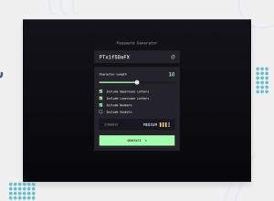
Design comparison
Solution retrospective
- Glad I did the HTML/CSS relatively fast
- I thought about using ASCII codes for a password algorithm and managed to make it work
- I refactored the functions to pure, and split the code to be somewhat modular
- Would probably choose a different method or look into a library, if this was something other than a demo project
- Creating the range input was a challenge, due to the browser defaults - I managed to find a resource that explains well how to remove the browser defaults and create your own.
- Styling the svg images was difficult due to how they resize
- Creating the 4 password categories took a lot of trial and error, to cover as many cases as I could
I think there could be some more refactoring done to the code.
Community feedback
- P@medic-codePosted 9 months ago
Hi there,
General comments Pretty good approach to the challenge. The user experience is good, there's a few minor UI aspects and the logic for too weak, weak,medium and strong passwords was a little difficult to figure out as a user. The HTML and CSS are pretty solid with just a few minor aspects i can think about. The JS was pretty difficult as a challenge, and feel like there's perhaps some room for improvement in the implementation, however you managed to get the user experience correctly.
Specific feedback
UI aspects
- On first load of the screen you don't have the placeholder present in the password box
- The slider is default to 10 when it should be for 0
- The checkbox's should have background of green and larger than they currently are
- The space between the colours is a bit too close than the design
- The copy icon when clicked should display 'COPIED' afterwards - little hard for the user to know if its successfully copied without it
HTML
- Consider using main rather than a <div class="container-wrapper"> - more semantic.
- Consider using BEM or another methodology for class names, however the names are not bad - plus using utilities.
CSS
- Try to use relative units for font-sizes, padding, margins (REM) for example rather than px, better experience for responsive design.
- The classes names too weak, weak, all have the same properties, can consolidate these into one.
- I haven't checked all the measurements in the breakpoints, but i had to change many different properties from the switch from mobile to tablet sizes - so there's perhaps some things to considere here.
JS
- The clipboard function looks pretty decent
- The biggest parts to consider are the generating password and generating strength functions, there's a lot of if statements which usually is a sign there is some refactoring to do. 2.1 I suspect you've complicated logic for the strength of the password (I was pretty simple, increasing strength by adding one of the checked boxes) 2.2 Instead of using charcode, have you considered just using a string with the numbers, letters and choosing from them randomly ? The way that i did it is that i choose randomly from the checked list and then randomly again in the specific checked box characters/numbers/symbols.
Marked as helpful1 - P@AntonvasilachePosted 9 months ago
Solid feedback. Thanks for taking the time to write this. The HTML & CSS points are something I'm getting used to implementing. For the JS it could have been either of the two solutions, I just picked the more interesting one for me.
0
Please log in to post a comment
Log in with GitHubJoin our Discord community
Join thousands of Frontend Mentor community members taking the challenges, sharing resources, helping each other, and chatting about all things front-end!
Join our Discord
