Submitted 11 months ago
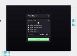
Password Generator App (JS/SCSS)
#sass/scss
@bartoszdudziak-dev
Design comparison
SolutionDesign
Solution retrospective
What are you most proud of, and what would you do differently next time?
- Generally I am proud of that it works 😅 Except that I feel it should looks a lot better
- Next time I would use ready components and create better structure of my code
- I have just wanted to make it works cuz of I started to getting lost in my code
- The most difficulty was to style input of type range and checkboxes because of their weird basic behaviour
- I had to find some information about webkits and etc.
- I created very simple algorithm which rate password strength, it definitely needs a improvement
Leave your opinion about anything you think about my solution. Thanks 🫡
Community feedback
- P@danmlarsenPosted 8 months ago
Hello, Bartosz Dudziak! 👋
Congratulations on finishing another challenge! Your solution responds quite well and looks nice 👏
I only have one suggestion:
- The slider seems to have a few issues on the firefox browser. You probably just need to make a few adjustments on the ::-moz-range-thumb and it will be perfect 👍
Happy coding. 💻
Dan
Marked as helpful0
Please log in to post a comment
Log in with GitHubJoin our Discord community
Join thousands of Frontend Mentor community members taking the challenges, sharing resources, helping each other, and chatting about all things front-end!
Join our Discord
