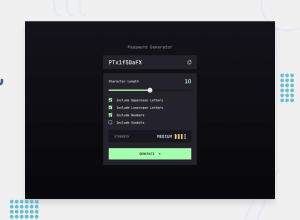
Password generator app | Typescript, Next.js, React, Tailwind CSS
Design comparison
Solution retrospective
Generating the password was a bit of a LeetCode challenge. I didn't expect my components to rely so heavily on each other. I had to go back and forth refactoring a few times to get the strength indicator and password generator to work together.
Whiteboarding and planning out the code first would have been beneficial here.
What challenges did you encounter, and how did you overcome them?I initially used a lot of if statements in the password strength indicator which may not have been the best solution. They were long, included a lot of conditionals, and it wasn't very readable. I later went back and added a counter so based on the number of points for character length and items included it became easier to read and judge what was a weak password compared to a strong password.
What specific areas of your project would you like help with?The CSS on the slider could still be better. It's not a perfect match with the Figma design, but for the time being it's a compromise I'm happy with. I felt that I would have spent too much time with that one element when that time could have been better spent in other areas.
Community feedback
Please log in to post a comment
Log in with GitHubJoin our Discord community
Join thousands of Frontend Mentor community members taking the challenges, sharing resources, helping each other, and chatting about all things front-end!
Join our Discord
