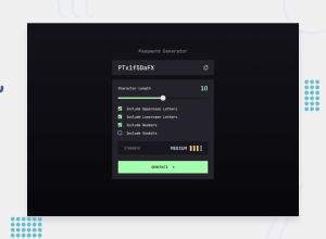
Design comparison
Solution retrospective
Whewww!!! . . . . This looked deceptively simple at first, definitely worthy of being an intermediate ranked project!!!
getting the strength display was fun and is what I am most proud of.
What challenges did you encounter, and how did you overcome them?A lot like figuring out how copying to the clipboard works, determining the strength of a password using regex and the css tricks involves, and also overriding the default styling for html input elements.
loads of googling and chatgpt helped.
What specific areas of your project would you like help with?nothing for now!!!
Any tips to improve is welcome
Community feedback
- @brainkaPosted 10 months ago
Hey!
I totally agree, it was very deceptive but equally great and challenging.
Really good job on this project :)
1 - P@nataliesmythPosted 10 months ago
Great job!
I just finished this project as well, it was definitely more intricate than it seems on first glance.
The functionality is great, my only suggestion would be to make the slider thumb in css using the -webkit-slider-thumb and -moz-range-thumb properties, and remove the white border from the strength meter by setting it to transparent.
Great job!
0
Please log in to post a comment
Log in with GitHubJoin our Discord community
Join thousands of Frontend Mentor community members taking the challenges, sharing resources, helping each other, and chatting about all things front-end!
Join our Discord
