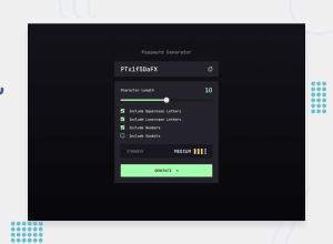
Design comparison
Solution retrospective
I'm most proud of somehow making the slider's styles correctly. This looked simple at first but seeing how convoluted the support for range inputs is was so frustrating.
What challenges did you encounter, and how did you overcome them?A lot of trouble styling the slider correctly on Safari and Chrome since the webkit is missing one pseudo class to style the left side of the slider, so I used a linear gradient with strict color stops instead.
Community feedback
- @OswalldPosted 5 months ago
Hi! Great work, you weren’t lazy like me and really put effort into designing the checkboxes.
Just a small improvement: make sure that at least one character of each selected type is included (when the requested password length allows for it).
Keep it up! (I’ll be moving to React like you soon :) )
Marked as helpful1
Please log in to post a comment
Log in with GitHubJoin our Discord community
Join thousands of Frontend Mentor community members taking the challenges, sharing resources, helping each other, and chatting about all things front-end!
Join our Discord
