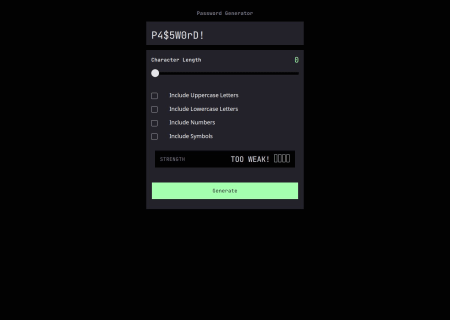

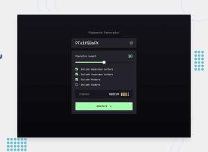
Design comparison

Solution retrospective
I'm proud to have successfully implemented JavaScript in my project. While I've focused heavily on DOM updates, I've realized the importance of visually appealing CSS. For my next project, I plan to prioritize both clean JavaScript and pixel-perfect CSS design.
What challenges did you encounter, and how did you overcome them?My biggest challenge was styling the input range and I overcame that challenge with a lot of Googling and Youtube videos!
What specific areas of your project would you like help with?I would love to have help with using the Figma files. I do not understand how to use the information provided to get width and height from the files provided.
Community feedback
- @AssSam7Posted 7 months ago
Good work pal!
A few things to improve upon,
- The checkbox looks distorted in the checked state. The tick gets translated to the bottom right and also is not visible. (Sorry unable to share the screenshot here)
- The responsiveness could be improved, as soon the breakpoint is hit for the tablet instead of the center the container moves to the top of the page where as per the design it should be at the center both vertically and horizontally). It might be because of the width of the container.
Marked as helpful0 - P@djneillPosted 7 months ago
If you double-click the element that you want to know the size of, for example, the input box that displays the password. On the right-hand side, it will have a 'w' for width and 'h' for height, the numbers displayed are the size in pixels. I can't share a screenshot here but if you look at the below link a similar question was asked in the Figma "ask the community" forum.
Marked as helpful0


Please log in to post a comment
Log in with GitHubJoin our Discord community
Join thousands of Frontend Mentor community members taking the challenges, sharing resources, helping each other, and chatting about all things front-end!
Join our Discord