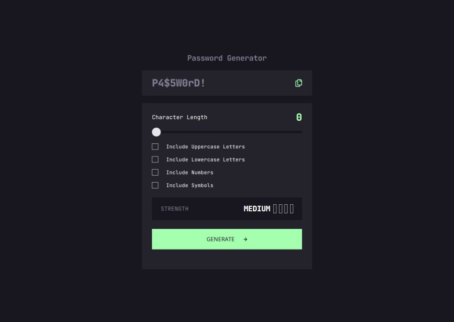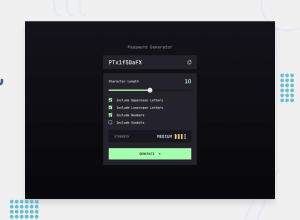
Design comparison
Solution retrospective
I’m proud of the layout and responsiveness of the project. Next time, I aim to write cleaner, more structured code.
What challenges did you encounter, and how did you overcome them?I came across a challenge to create a function that shuffles the elements of an array, which will display each password character randomly
Community feedback
- P@elisilkPosted 6 months ago
Hi 👋 @Godinhoweverson,
Congrats on a great solution. 👏 I love your implementation with JavaScript of the range slider so it has two different colors as it moves from right to left. That's definitely something I'd like to add to my solution. Nice job.
When you are ready to dive in further 🤿, I'd suggest a few things:
First, for your checkboxes, it doesn't look like the checkmark SVG is showing up. I think this is related to needing to use a relative path when putting in the URL for the SVG. Your code probably works well on your local machine, but when pushed to GitHub pages it doesn't. So I'd recommend using a relative URL like this:
input[type="checkbox"]::before {
  background-image: url(../images/icon-check.svg)
}
And then thinking about the responsiveness of your design, using the media queries is one way to go. But you might also consider letting Flexbox and the size of the content determine the width and the height in a more flexible way. For example, on your
maincontainer, I'd recommend you try removing the hard-coded height and width pixel values. Instead, replace them with:main { max-width: 540px; width: 100%; }If you try this out, and play with the viewport size, you will see that the container resizes itself pretty well (although admittedly not perfectly). You'd probably have to make a few other modifications of the elements inside
mainto make the whole design work out, but I hope you get the idea.Anyway, just some ideas to consider if you are thinking about improving on this solution. 🤔
Happy coding. 💻
Eli
Marked as helpful0@GodinhoweversonPosted 6 months ago@elisilk Thank you for your feedback! I didn’t notice that the checkmark SVG wasn’t displaying correctly. I also appreciate your advice on responsiveness—I’ll definitely implement that in my next project!
0
Please log in to post a comment
Log in with GitHubJoin our Discord community
Join thousands of Frontend Mentor community members taking the challenges, sharing resources, helping each other, and chatting about all things front-end!
Join our Discord
