Design comparison
SolutionDesign
Please log in to post a comment
Log in with GitHubCommunity feedback
- @Boffdub
Nice work!
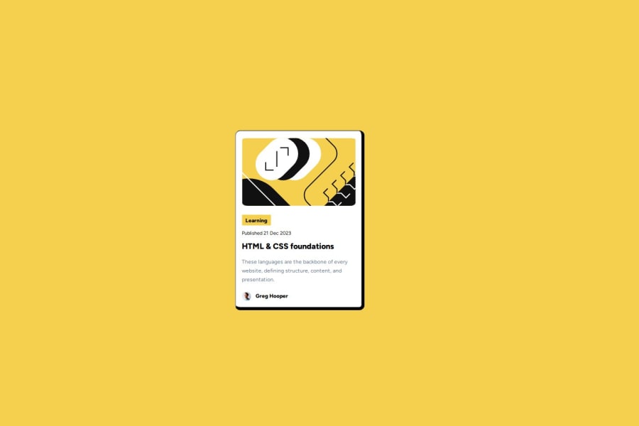
I think I got a good sense of how you did this and it seems to have worked. I did notice the card itself is pretty small, so I make it bigger if you were to do it again.
Join our Discord community
Join thousands of Frontend Mentor community members taking the challenges, sharing resources, helping each other, and chatting about all things front-end!
Join our Discord

