Design comparison
SolutionDesign
Community feedback
- @jasoneczekPosted 8 months ago
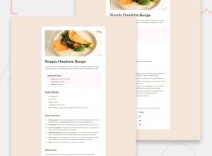
Your solution looks good, but on my phone it is really skinny. I think it might be your margin for the container is 60px all around. Maybe if you lower the left and right margins it will look better. I would also avoid using px for your font sizes and use rem instead. I think in the table, Calories, Carbs, Protein and Fat would the table headers and with scope of row. Hope this helps, nice job!
Marked as helpful1
Please log in to post a comment
Log in with GitHubJoin our Discord community
Join thousands of Frontend Mentor community members taking the challenges, sharing resources, helping each other, and chatting about all things front-end!
Join our Discord
